Summary
- The collaborative release modifies the classic unstructured cap silhouette with a subtle structural twist
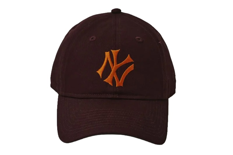
- A signature feature is the front team logo embroidery which has been deliberately tilted exactly 25 degrees counterclockwise
- The standard-angle logo is strategically hidden on the back of the cap as an unexpected physical detail
The JOURNAL STANDARD x THE STAND fool so good(s) x New Era 9TWENTY collection is a calculated exercise in subtle structural manipulation. Debuting as part of a 16-color release, the triple-threat collaboration zeroes in on altering the foundational components of the iconic baseball cap without losing its classic shape.
Focusing purely on physical construction, the release utilizes New Era's coreless "9TWENTY" silhouette as its base. Defined by an unstructured six-panel crown and a pre-curved visor, the model provides a naturally relaxed fit that is further emphasized by the implementation of washed, vintage-processed twill materials. Rather than overhauling the blueprint with heavy graphics, the design language relies on precise, technical alterations to the existing framework.
The defining specification of the release lies in its embroidery alignment. On select models within the lineup, the iconic front team logo has been rotated exactly 25 degrees counterclockwise. This specific off-axis tilt introduces a jarring yet minimal visual shift to the familiar headwear. Balancing this modification, the physical design incorporates a grounded hidden detail on the reverse side: a standard-angle, non-tilted team logo is discretely embroidered at the back of the cap near the adjustable sizing hardware, completing the conceptual construction.
The JOURNAL STANDARD x THE STAND fool so good(s) x New Era 9TWENTY caps drop in mid-April via THE STAND fool so good(s) in Toranomon, Tokyo, and select JOURNAL STANDARD locations.
Click here to view full gallery at Hypebeast
